

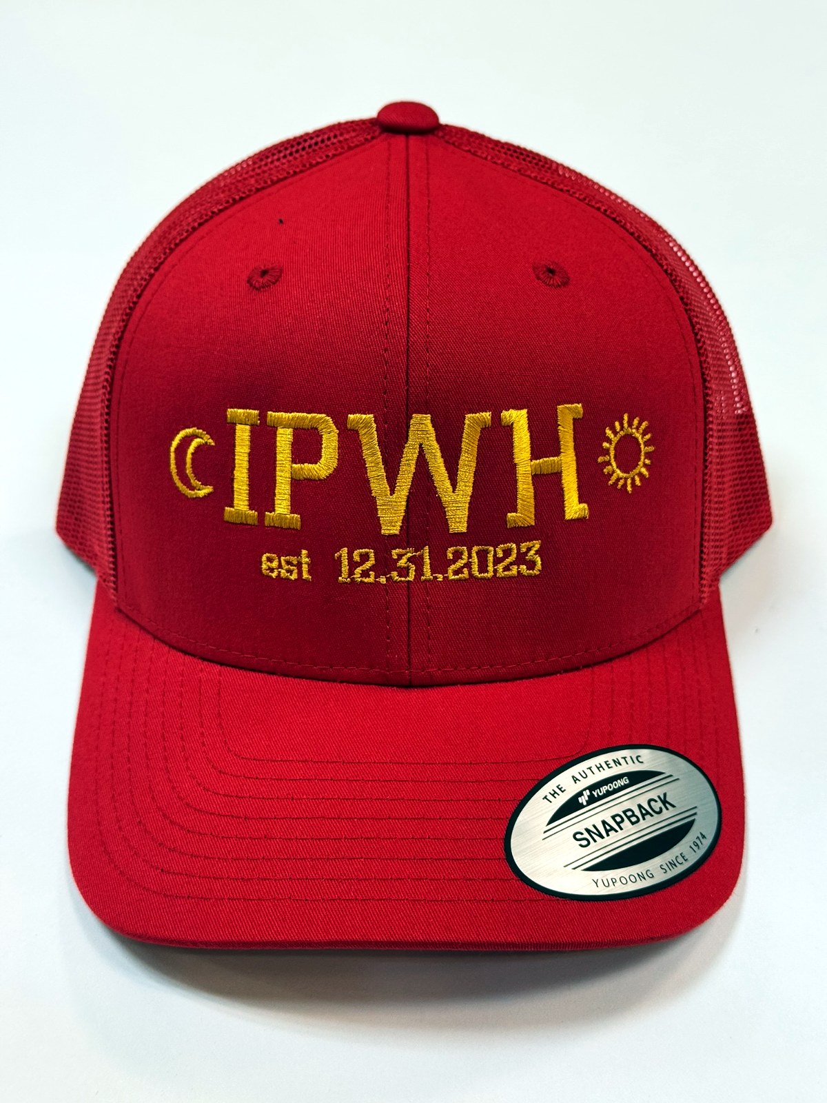
For clean, readable embroidered hat text, keep capital letters at least about 1/4 inch tall in a simple block font. Script and decorative fonts need more room, usually 0.35 to 0.5 inch. Below that, the thread can’t form the letter shapes, and small text fills in or blurs.
Why embroidered hat text size has a limit
Every stitch is a piece of thread with real width. A letter needs enough room for the thread to form its strokes and the gaps between them. When text gets too small, the inside of letters like “e”, “a” and “B” closes up, and thin strokes in script fonts break apart. On the curved front of a cap, it’s even harder.
Smallest letter height by font
Our hat designer uses fonts from Wilcom EmbroideryStudio’s embroidery font library, and each has a minimum height for its capital letters. Here are a few popular ones:
- Block 2, Block 1, City Medium, Arial Rounded, Avant Garde, Comics: about 0.25 inch
- College, Times Roman, Garamond, Flash, Kids, Centurion: about 0.3 inch
- Free Style, Script 5, Stencil Block: about 0.35 inch
- Script 8, Lila, Handy Script: about 0.4 inch
- Old English: about 0.45 inch
- Edwardian Script, Formal Script: about 0.5 inch
The designer shows the letter height as you resize your text and warns you if a line gets too small for its font.
Tips for readable text on a hat
- Use fewer words. A short line can be bigger. “SMITH ROOFING” reads better than a full sentence.
- Choose a bolder font for small text. Block fonts hold their shape at small sizes far better than thin scripts.
- Move the small stuff. Put a phone number, website or tagline on the back, where it can have its own line.
- Watch the letter spacing. Letters packed too tight can run together in thread. A little extra spacing helps.
- Pick contrast. Thread close to the hat color makes small text even harder to read.
How much text fits on each spot?
The front of a cap has the most room. One or two lines of text fit comfortably, and the designer shows a stitch area so you can see how much space you have. The sides are smaller, so they’re best for a short word, a year or a name. The back fits a single line well, like a website or a slogan.
On the beanie, the cuff is the only spot, so keep it to a logo or a few bold words.
Small text inside a logo
Many logos include tiny text, like “EST. 1998” or a tagline under the name. When the whole logo shrinks to fit a hat, that text often ends up too small. You have a few options:
- Make the logo bigger on the front.
- Use a version of your logo without the small text.
- Stitch the small text as its own line on the back.
A real person checks every design before stitching. If your text is too small to stitch well, we’ll contact you before we start. Our guide on logo and design questions has more.
Quick answers
Can I fit a phone number on the front?
You can, but it usually looks better on the back, where it can be larger and won’t crowd your logo.
Is lowercase text harder to stitch?
Lowercase letters are shorter than capitals at the same font size, so give mixed-case text a bit more height than all caps.
Try your text on a hat
Open the hat designer, type your text and resize it. You’ll see the letter height, any warnings and your price as you go.